I led a design and UX team in the redesign of K2’s website, focusing on the Homepage, Platform page and Product pages and then applying the new framework and design throughout the rest of the website pages.
The request came about because after a brand and site redesign by an outside agency the websites led generation conversion had dropped dramatically and scroll depth and click through had also dropped on key pages (homepage, Platform and Product pgs).
We used the brand color green as a guidepost throughout the redesign of the digital identity.
We redesigned the digital design system with an eye towards accessibility and scalability. Ensuring the design was both adaptive and responsive.
Refreshed and Branded Icon Libray
Sleek, clean and with the addition of the guidepost green to carry the brand color through from digital to print where possible.
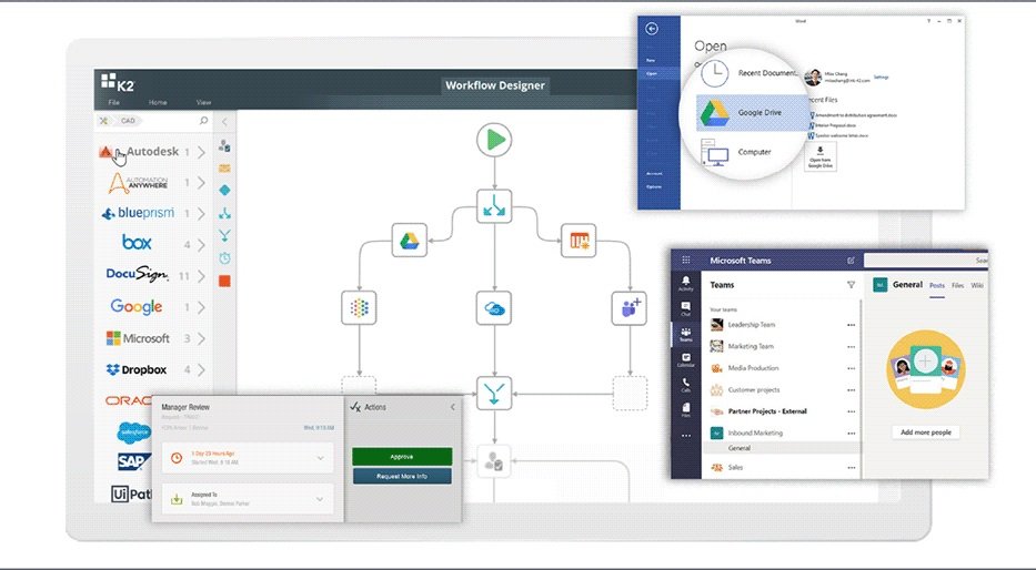
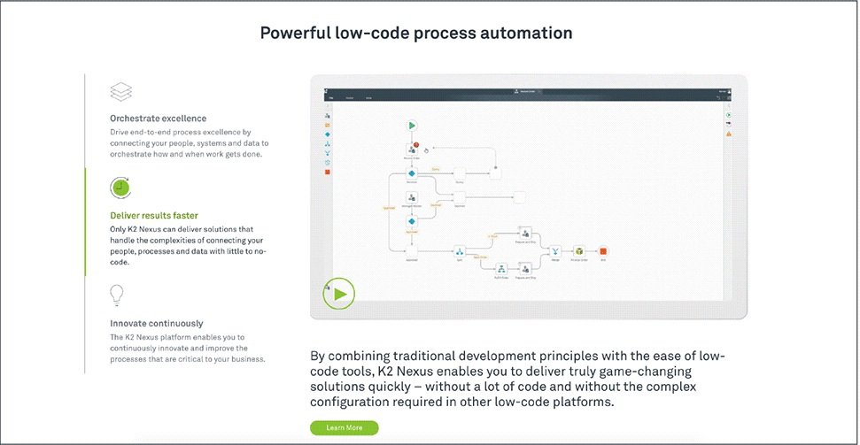
We created new modules that could be used site wide that were focused on flexibility, consistency and scalability. We also indexed on featuring the product where ever possible.


Although it’s hard to measure the ROI of design, with the new K2 design system in place we saw all metrics go up, scroll depth increase, clickthrough rates and page views increase as well as demand generation.
As a bittersweet ending K2 was bought by it’s main competitor Nintex a year ago.


